ARC
About The App
ARC had a pre existing application but based on the infrastructure the application was built on, it was hard to develop features and a user interface that meets todays standards. Thus the company decided it would be cost beneficial to redo the application from the ground up.
The Goal
The goal was to build an intuitive and enjoyable application that would make it much easier for the customers to have the information they needed with a rich feature set and clean, unique, and intuitive UI.
UX Process
User Research / User Personas
I started the process by researching similar apps, seeking out and understanding competitors features. From the list that I found, the top three apps that stood out were Mint, Grip, and Prism. I made an analysis of their core features. They integrated the user’s bank account information, effective and easy solutions for savings goals, to track activity and making financial planning intuitive and fun.
During the research, I started to list all the features I found on those apps that could help the user to understand and control their financial life. From this analysis, I saw that the common features were based on giving the user more information and making this very visual: graphics visualization, expenses categories, monthly budget, timeline control, income control, and automatic or manual expenses registration. Mint, Grip and Prisim stood out over the other financial apps because of their automatic expense trackers. This solved one of the the major problems for the user having to manually add each item. Although the biggest caveat was this feature had some quirks where reacquiring expenses could not be adjusted. the user would have to delete the occurrence and manually adjust so the user could adjust variances in expenses to reach his or her goal.
Through analyzing the results of my research, most apps can help users to control their expenses, but I could not find an app that is really focused on features to help users achieve their life goals like saving money to buy a house or to travel, or an even smaller goal, like to buy a new phone or any other goals that depending of finances.
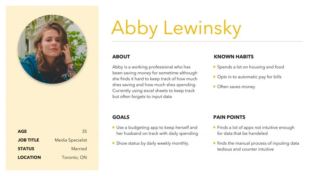
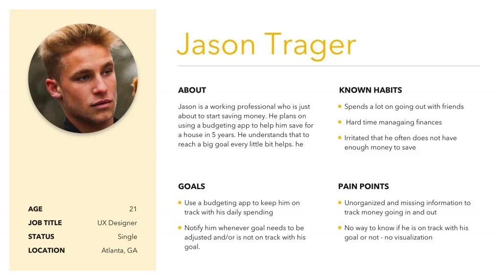
User Research / User Personas
In order to understand the user’s journey, I started to interview potential customers addressing problematic points and all the details about how they try to manage their finances. To create this customer journey, I chose to focus on users that still don’t use apps to control their finances, and are manually updating spreadsheets and also some that have tried to use other apps but have failed.
Wireframe / Prototyping
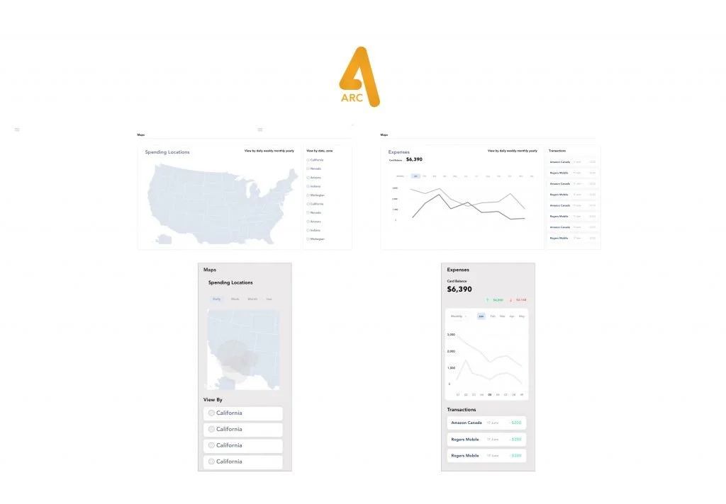
We started with the features we already had because we already had a good idea of which features were being used most also this was good for time to market and sales. We went back and forth with user research and lo-fidelity mock ups as much as we could with tweaks and fundamental rethinking of the features we had. After we got the features and tweaks down, I created Prototypes so the users could get a better feel of the product, it’s UI, and its functionality. Then we proceeded with the new features we wanted to add and the surveying and tweaking the features as much as we could, while keeping complexity for user low and keeping the UI clean.
Mobile Experience
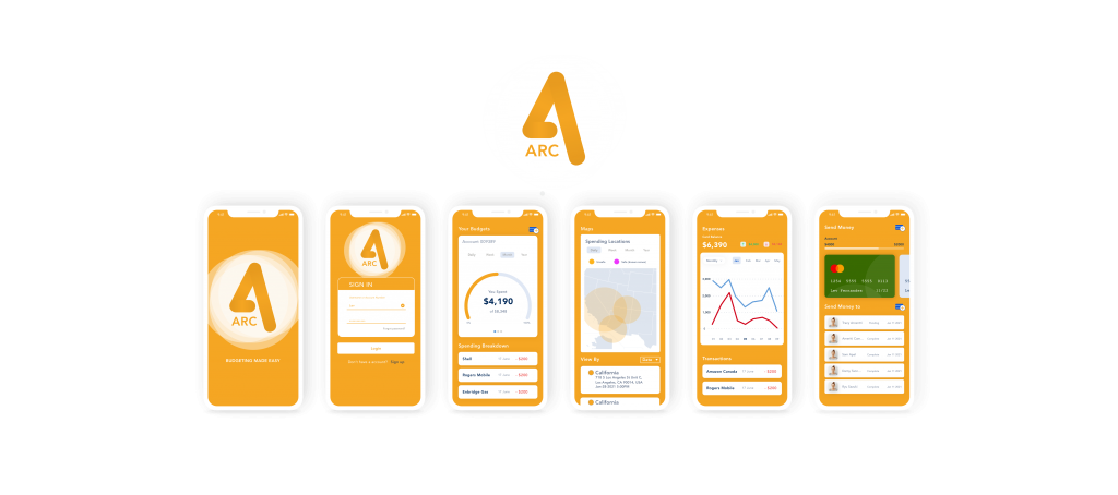
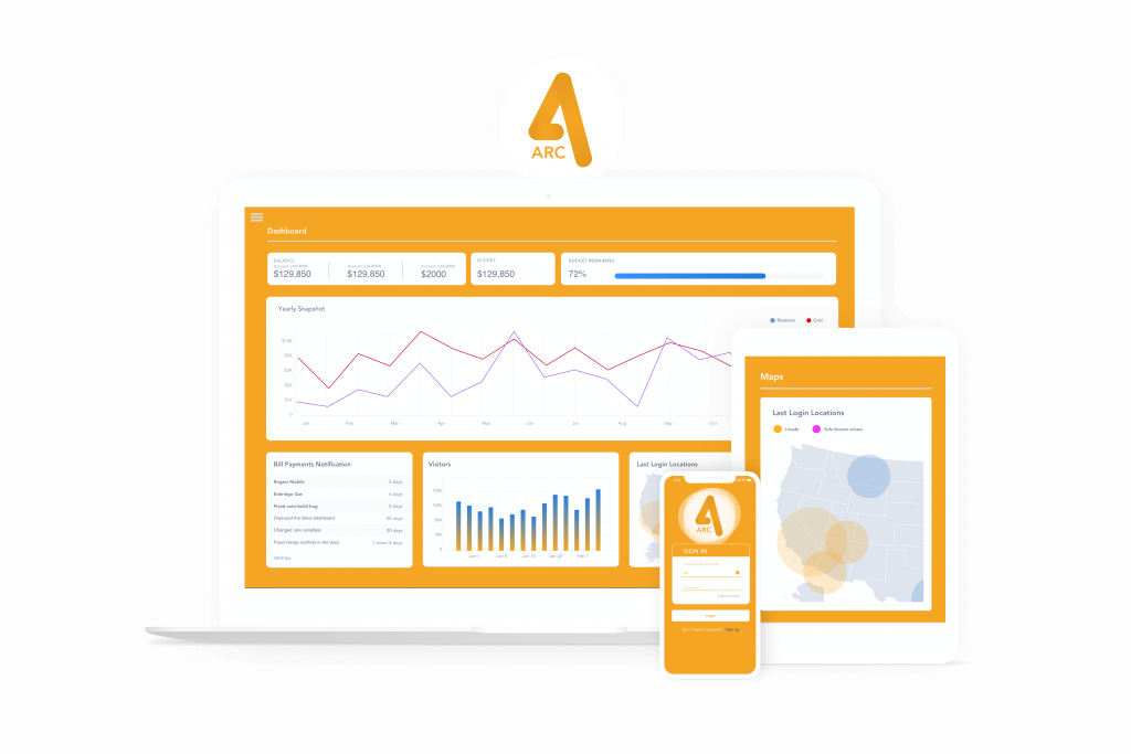
Creating a strong mobile experience for the users was one of the highest priorities when building the redesign of the application. It also had to be consistent with the desktop and tablet experience – basically designing across all platforms. Giving the UI a fresh and unique look was also imperative along with having a feature rich application where time was spent on user research for feedback for each of the features.


